|
Maps of the Internet There are hundreds of “maps of the internet,” but most are rather illegible (scientists will always need designers!), and most are just variations on a few basic types. I’ve identified four main kinds of maps; below are some of the best of each variety.
Note that most maps of the internet don’t come with very good legends, or even explanations of what’s going on. I’ve tried to include this information below as best as I can. I've taken these from various sources, notably the “Atlas of Cyberspaces” website, which unfortunately is now out of commission.
| |
|
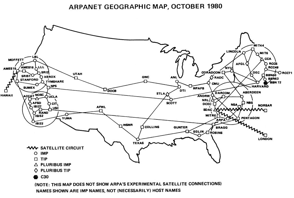
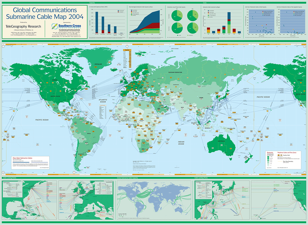
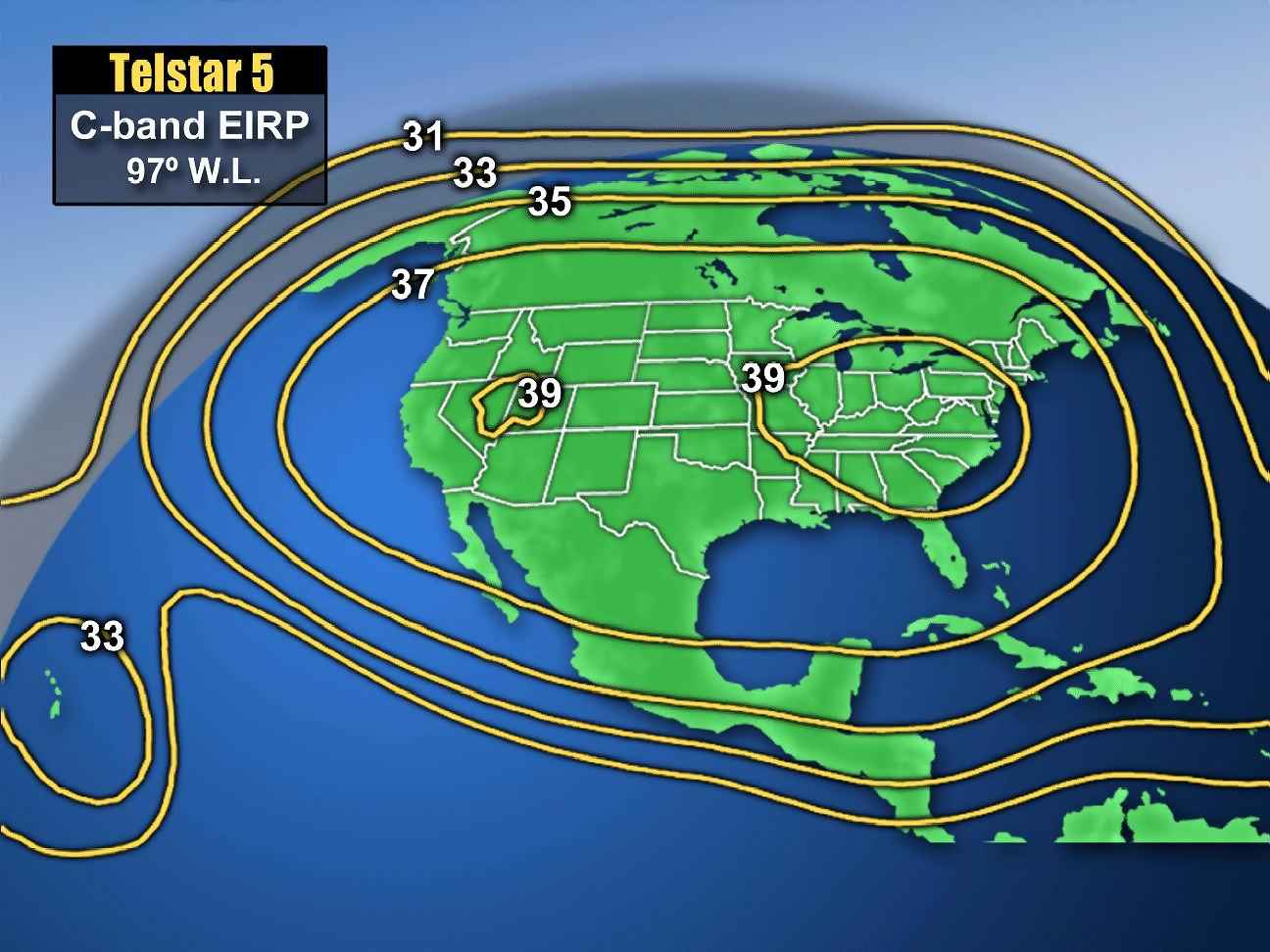
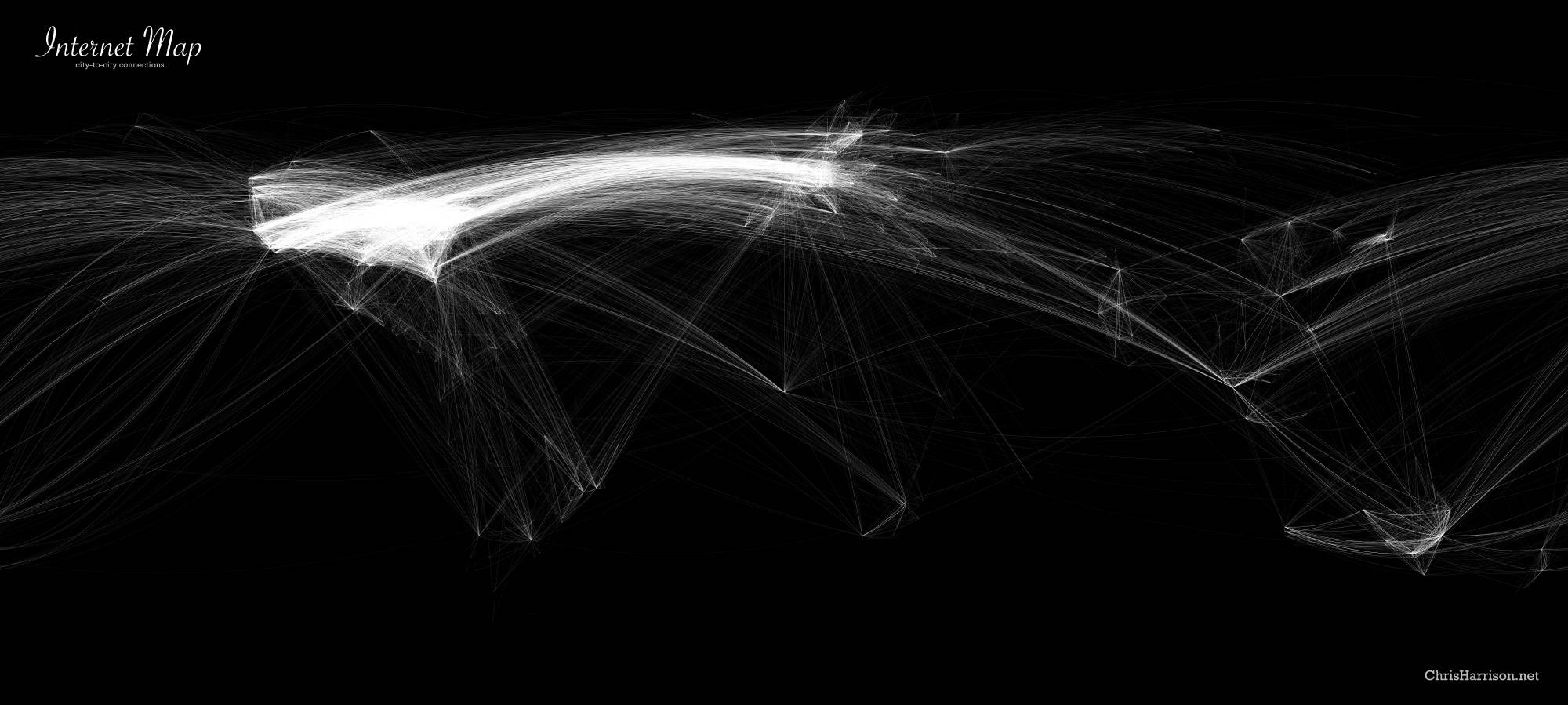
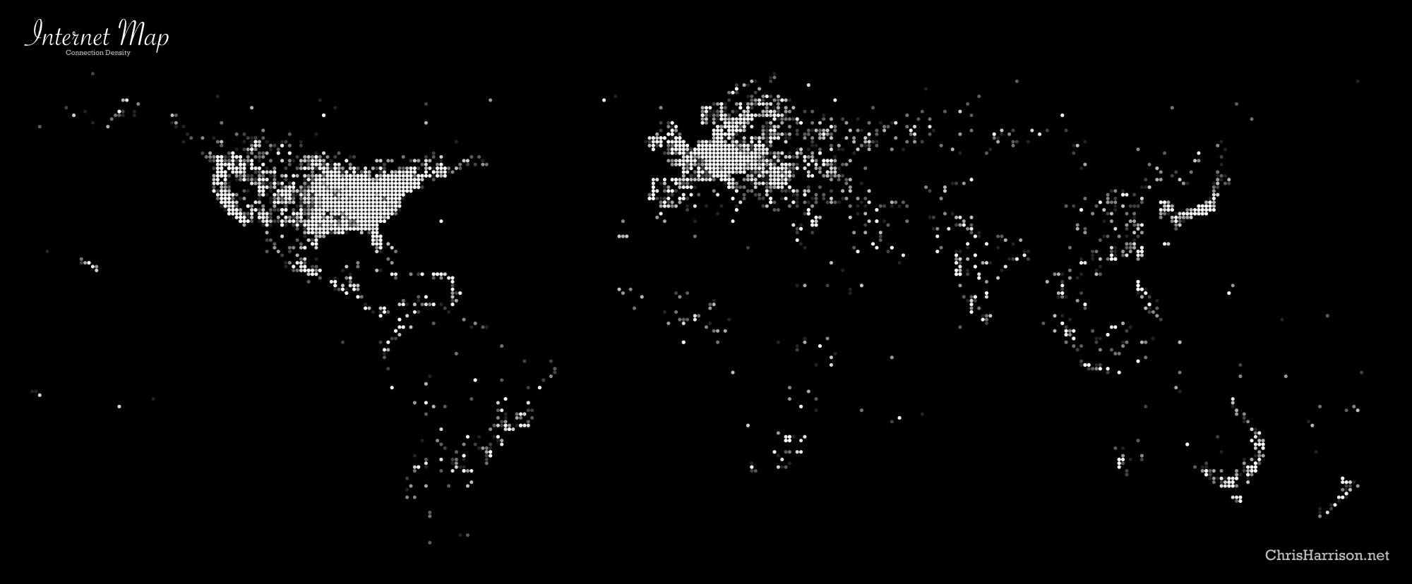
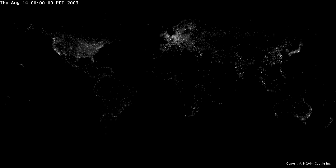
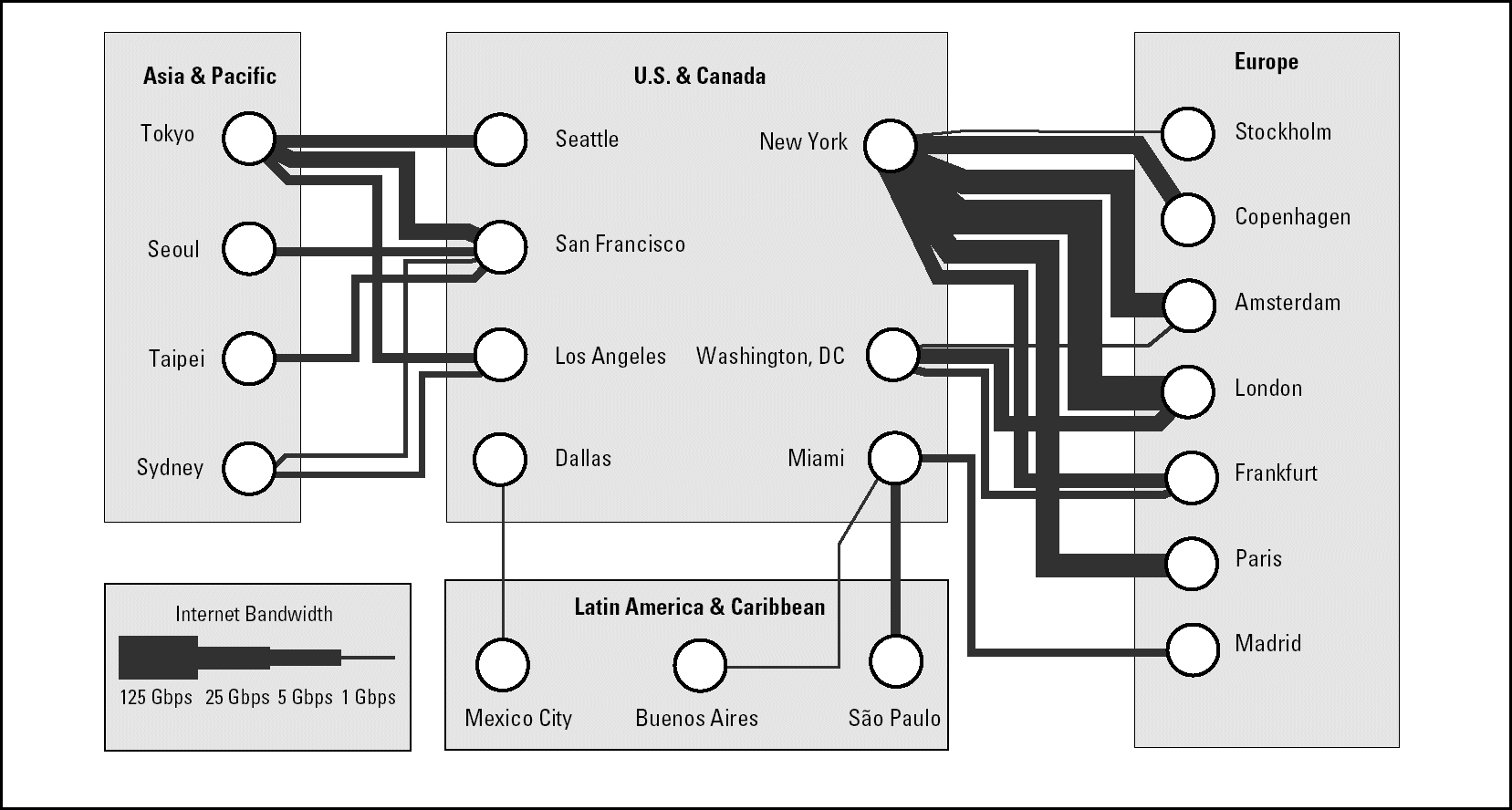
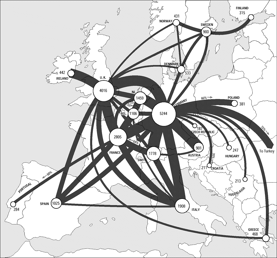
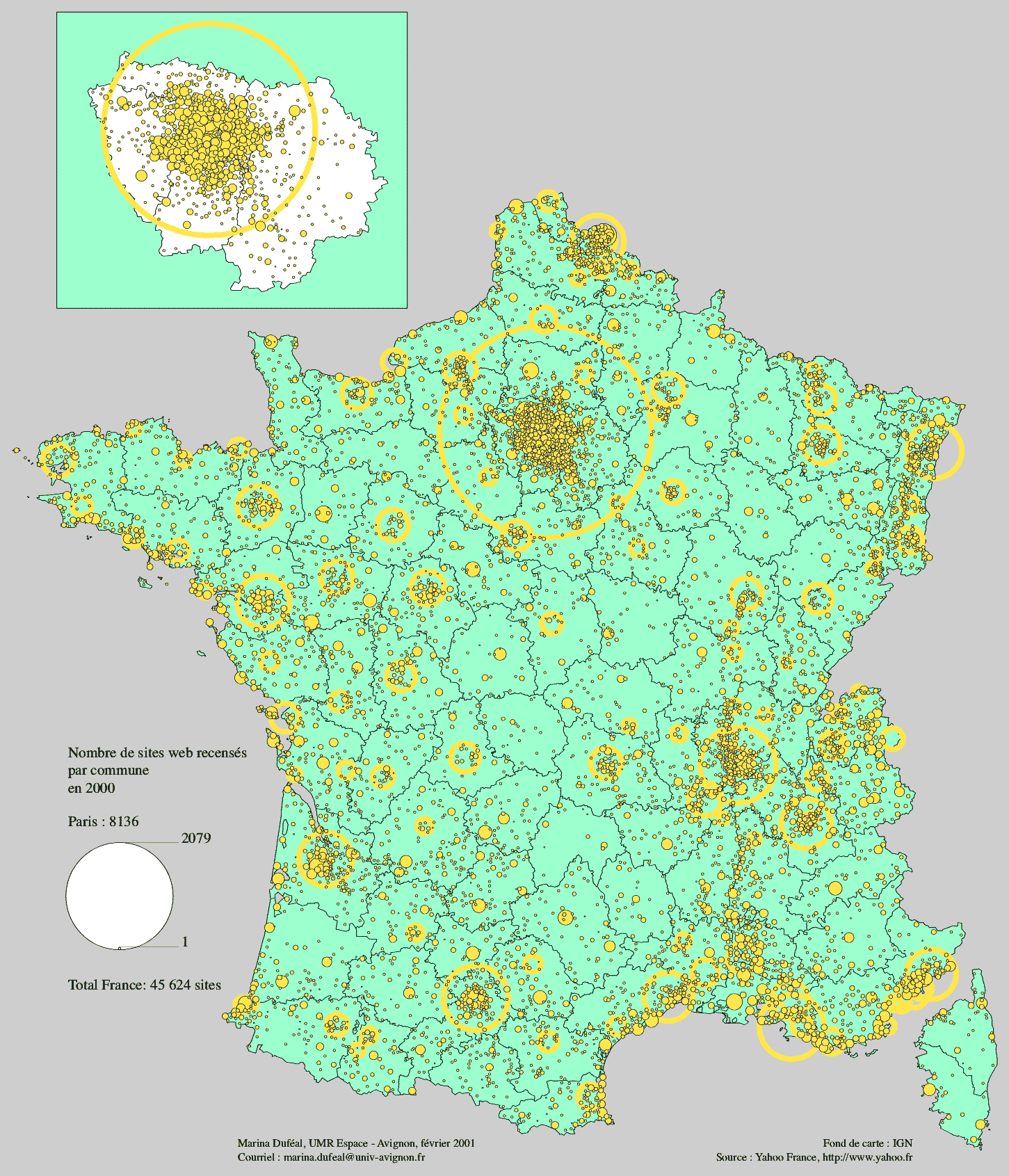
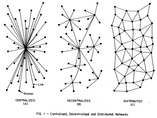
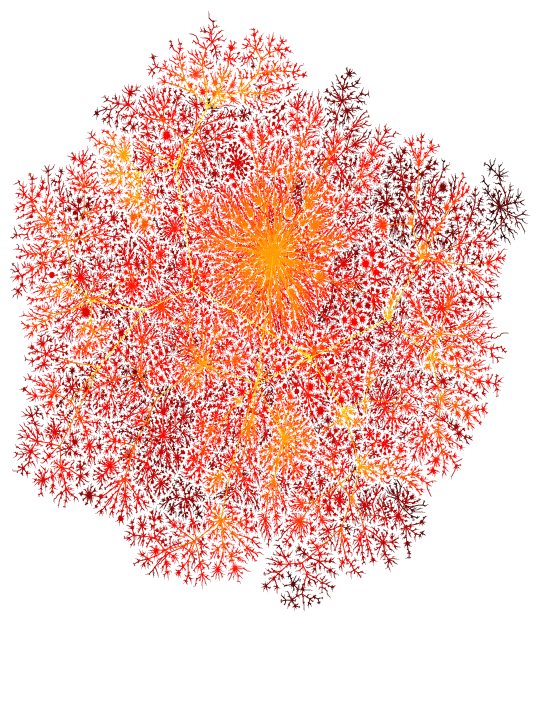
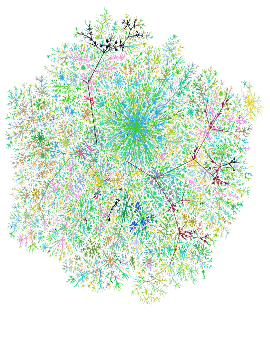
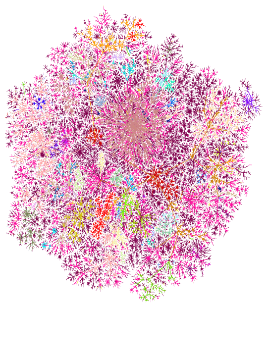
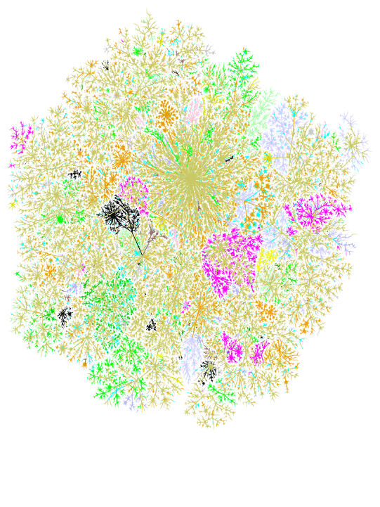
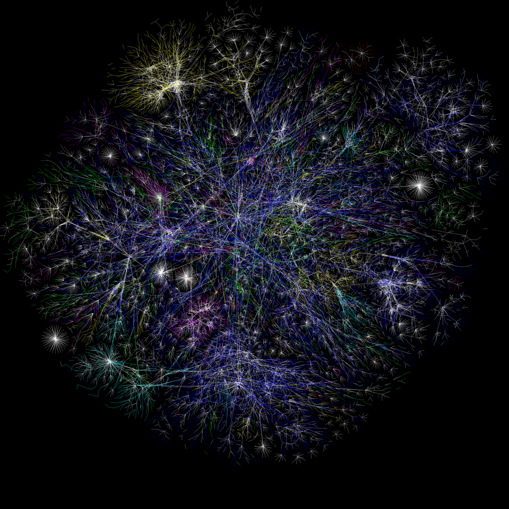
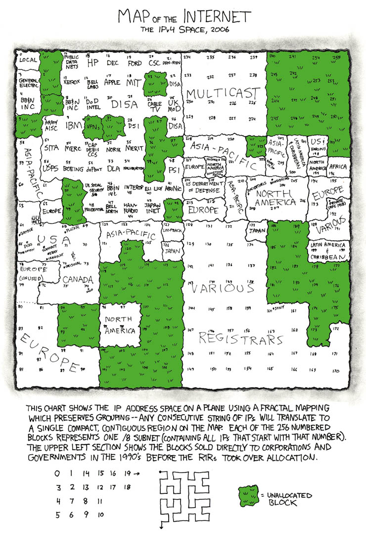
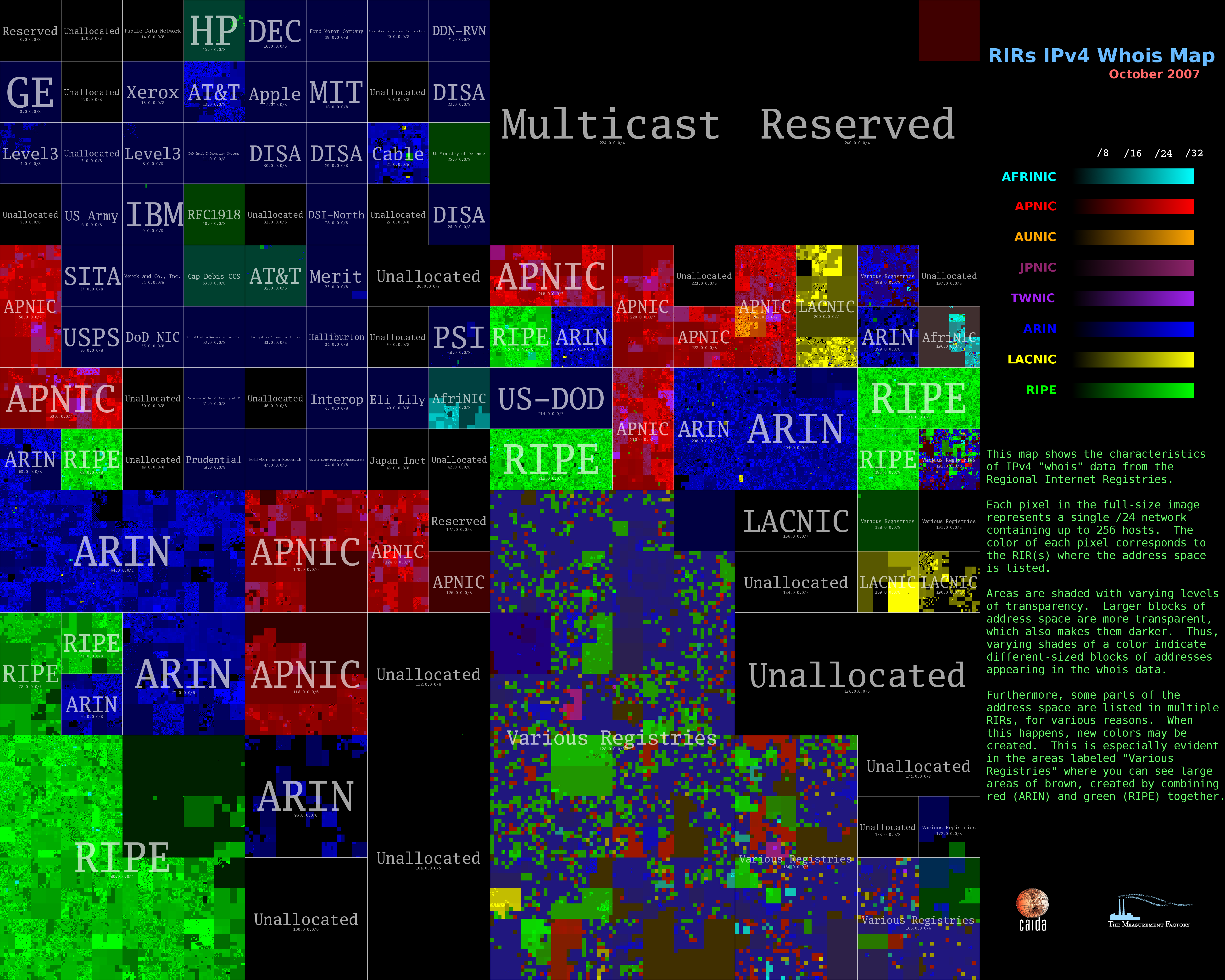
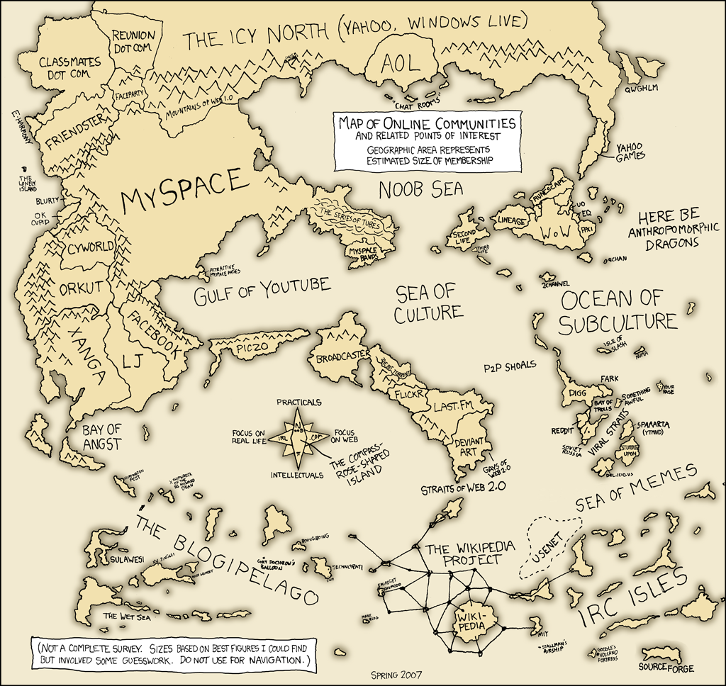
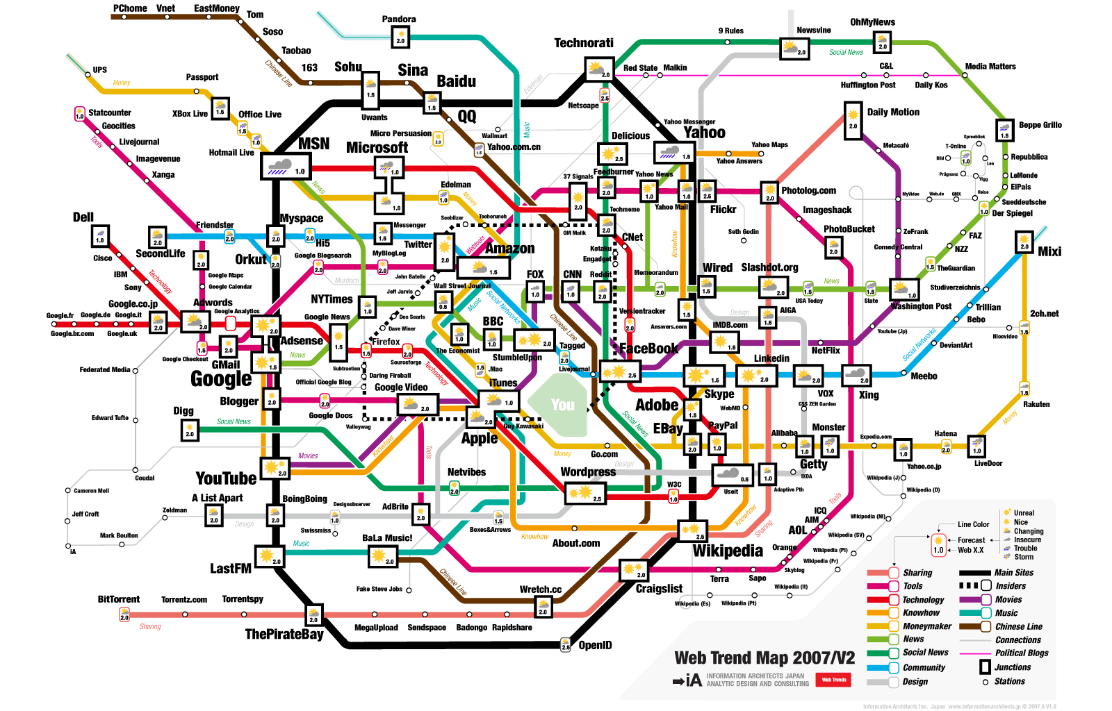
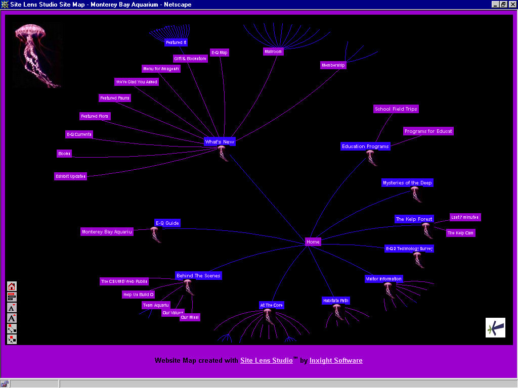
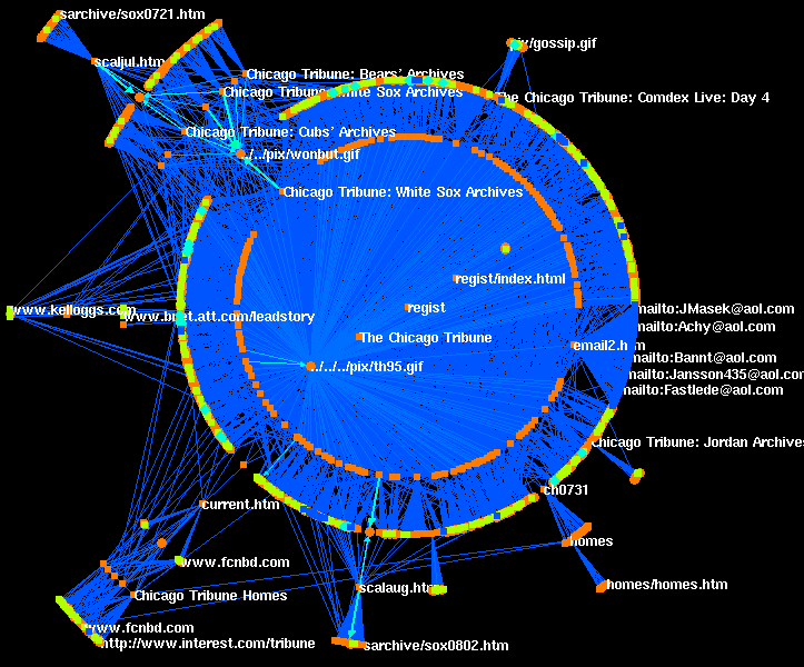
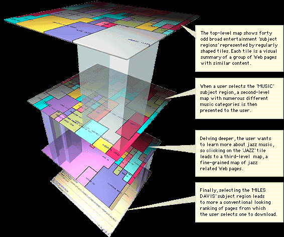
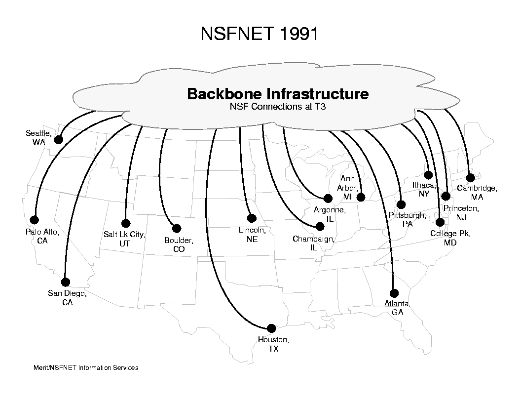
Geographic maps These maps show the distribution of internet infrastructure or use around the world. The goal is usually to show the great differences between highly connected and unconnected areas. • the ARPANET in 1980 • submarine cables in 2004 • signal strength for a U.S. satellite (naturally, there are many more) • city-to-city connections in 2007 – this shows city connections by router configuration, not by physical backbone • connection density – a density map using the same data • google searches over a 24-hr period in 2003, using georeferenced IP information • international bandwidth in 2001 • european data flow in 1995 • domain-name registrations in France, 2001 Topological maps These maps show physical connections between different servers, but the servers aren’t located geographically. These maps are still essentially geographic, however, as they show the paths that data might take to go from one server to another. • Paul Baran’s diagram from 1960 shows the basic idea. His diagram was used to show how the distributed network could survive a nuclear attack. • Probably the best known maps are from the “internet mapping project” by some researchers at Lucent. These maps show data paths from one server to all the other servers connected to it. The particular image which results will thus depend a lot on the choice of the central server. Here are some maps from 1999, with different color schemes (none, unfortunately, with legends or text labels): colored by distance from central server — IP address — major Internet Service Providers — top-level domain (.org, .mil, .jp, etc.). And here’s a quick FAQ from the authors, referring to a later version of the same idea. • a different version of the same idea, by different authors using more than one central server, to show interconnections. Their legend still isn’t so good: net, ca, us, com, org, mil, gov, edu, jp, cn, tw, au, de, uk, it, pl, fr, br, kr, nl, unknown . (Compare this image to Baran’s diagrams..) Domain-space maps Internet Protocol (IP) addresses are assigned to various companies, countries, and domains by international agreements. The number of IP addresses (of the form 255.255.255.255) is finite, and can be mapped as an address space. • a friendly version • a less friendly version Content maps These are attempts to represent heuristic connections between different kinds of websites. • online communities, 2007 • online communities, 2010 • a subway metaphor • There are plenty of ways to visualize individual websites, a technique which could certainly be scaled (though not without some degree of information overload). These range from the simple to the complex • There are also lots of content maps that are basically interface designs, such as this one based on Yahoo!’s organization. Perhaps the best-known example of something like this is the map of the market. A fifth variety is also worth pointing out: THE CLOUD. Here is one version. Here is another. |