
Bill Rankin, 2006
These maps show the distribution of income (per capita) around the 25 largest metropolitan areas in the US (all those with population greater than 2,000,000). The goal was to test the "donut" hypothesis — the idea that a city will create concentric rings of wealth and poverty, with the rich both in the suburbs and in the "revitalized" downtown, and the poor stuck in between.
This does seem to have some validity in older cities like Boston, New York, Philadelphia, or Chicago, but in newer cities it is not the case. Instead of donuts, one finds "wedges" of wealth occupying a continuous pie-slice from the center to the periphery.
Just from visual inspection, it also seems that poverty donuts all tend to have about a five-mile radius, regardless of the size of the city. Perhaps this is the practical limit for commuting without a car?
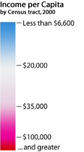
All maps are at the same scale, and all use the same color values for income.
Here is the income distribution for the entire US, again with the same color scale (mouseover to enlarge; compare to the location of Indian reservations and Hispanic Americans).
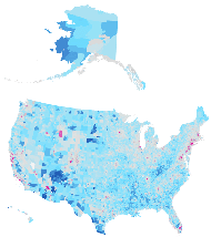
NOTE: These maps do not show the full extent of these metropolitan areas; the number below each city's name is my best guess of the population of the area shown, based on US Census estimates for 2006. My interest is not the metropolitan zone per se, but the zone within which there is wide income variation. Also note that these maps cannot be reliably used to compare the aggregate wealth of different cities, since they do not take into account population density (for this one would need to make a cartogram, which would make scale comparisons impossible).
Data Source: US Census, 2000
This is version 2.0, with conformal projections and updated population ranking.
