Bill Rankin, 2008
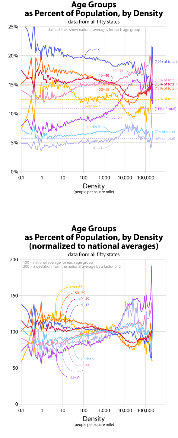
Conventional wisdom states that young adults like to live in the city, and older adults head for the suburbs. These graphs offer resounding confirmation of the common-sense pattern, and show that there is an important inflection point at about 3,000 people per square mile. At higher densities, people ages 18 to 39 (and their small children) are overrepresented, while at lower densities the opposite is true.
One of the overall goals of this series of graphs is to pinpoint discontinuities in density patterns. Might these graphs help understand where "suburban" ends and "urban" begins? What values should be used when shading density maps? Looking at all the graphs together, it seems there are discontinuities at approximately 10, 250, 3,000, and 20,000 people per square mile. These would correspond to sparse, rural, suburban, urban, and central-city densities. I’ve made a simple map of the U.S. with these break-points.
All graphs based on tract-level data from the 2000 census. Data do not include U.S. territories. For more information, see this quick discussion of my data.
