|
Bill Rankin, 2008
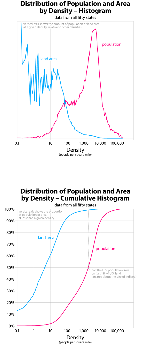
On a density graph, population and land area are directly related by simple mathematics. But seeing both variables at the same time offers a few insights. First, there is something interesting happening at low densities. Below about 50 people per square mile, there are roughly equal areas of land at each density; between 50 and 250 people per square mile, there are roughly equal amount of population at each density. Neither of these patterns correspond to the expected density distribution around a central city; judging just on density alone, 250 people per square mile seems like the dividing line between city-centric and dispersed settlement. (Between 250 and 20,000 people per square mile, the empirical data correspond quite well to a simple model of density decreasing logarithmically away from a dense urban core.)
The bottom graph provides an easy way to see how much land is occupied by various proportions of the U.S. population. Half the population lives on 1% of the land, and the densest 10% of the population lives on just 0.035% of the land. This data drives home the fact that, whatever the problems with urban sprawl, impending land shortage is not one of them.
One of the overall goals of this series of graphs is to pinpoint discontinuities in density patterns. Might these graphs help understand where "suburban" ends and "urban" begins? What values should be used when shading density maps? Looking at all the graphs together, it seems there are discontinuities at approximately 10, 250, 3,000, and 20,000 people per square mile. These would correspond to sparse, rural, suburban, urban, and central-city densities. I’ve made a simple map of the U.S. with these break-points.
All graphs based on tract-level data from the 2000 census. Data do not include U.S. territories. for more information, see this quick discussion of my data.