|
Bill Rankin, 2008
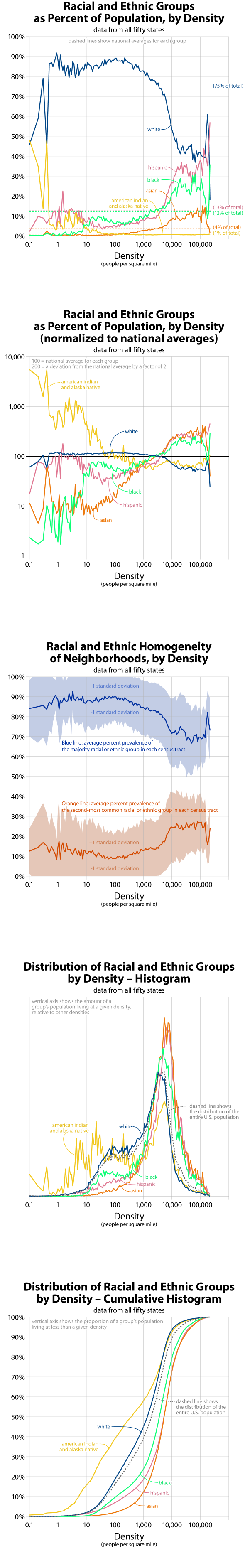
Race and ethnicity are some of the most defining characteristics of U.S. population distribution. The first two graphs show a remarkable shift between low densities and high densities. Below about 3,000 people per square mile, whites are the overwhelming majority. At higher densities, there is no clear majority group. Notice as well the discontinuity at about 10 people per square mile, which corresponds roughly to non-urban settlement west of the 100th meridian: very few rural blacks, a greater proportion of American Indians and Alaska Natives, and increasing numbers of Hispanic ranchers and farmers.
The third graph, however, shows that despite the lack of a clear majority group at high densities, neighborhoods are only slightly more integrated than in the suburbs. In city neighborhoods the local majority group still comprises about three-quarters of the population, and there are very few areas with more than two racial or ethnic groups living in the same neighborhood. Judging from the standard deviation spreads, truly integrated neighborhoods seem exceptionally rare.
The first three graphs show relative group representation at different densities; the last two show where people of different groups actually live. All groups have a strong urban contingent, including American Indians and Alaska Natives. But the last graph shows that, on average, Asians are the most urban group, followed by Hispanics, blacks, whites, and then Indians. Roughly 95% of Asians live at non-rural densities (greater than 250 people per square mile), compared with only half of all Indians.
Note that for the U.S. census, Hispanic is an "ethnicity," while the other categories are "races." These are different questions on the census form, and so percentage-prevalence values for racial and ethnic identification will sum to more than 100%. Also note that these graphs do not include the census categories of Hawaiian or Pacific Islander, Multi-Racial, or Other Race.
One of the overall goals of this series of graphs is to pinpoint discontinuities in density patterns. Might these graphs help understand where "suburban" ends and "urban" begins? What values should be used when shading density maps? Looking at all the graphs together, it seems there are discontinuities at approximately 10, 250, 3,000, and 20,000 people per square mile. These would correspond to sparse, rural, suburban, urban, and central-city densities. Iĺve made a simple map of the U.S. with these break-points.
All graphs based on tract-level data from the 2000 census. Data do not include U.S. territories. for more information, see this quick discussion of my data.
