
![]()
Bill Rankin, 2010
download full maps
(2700x2700 PNGs):
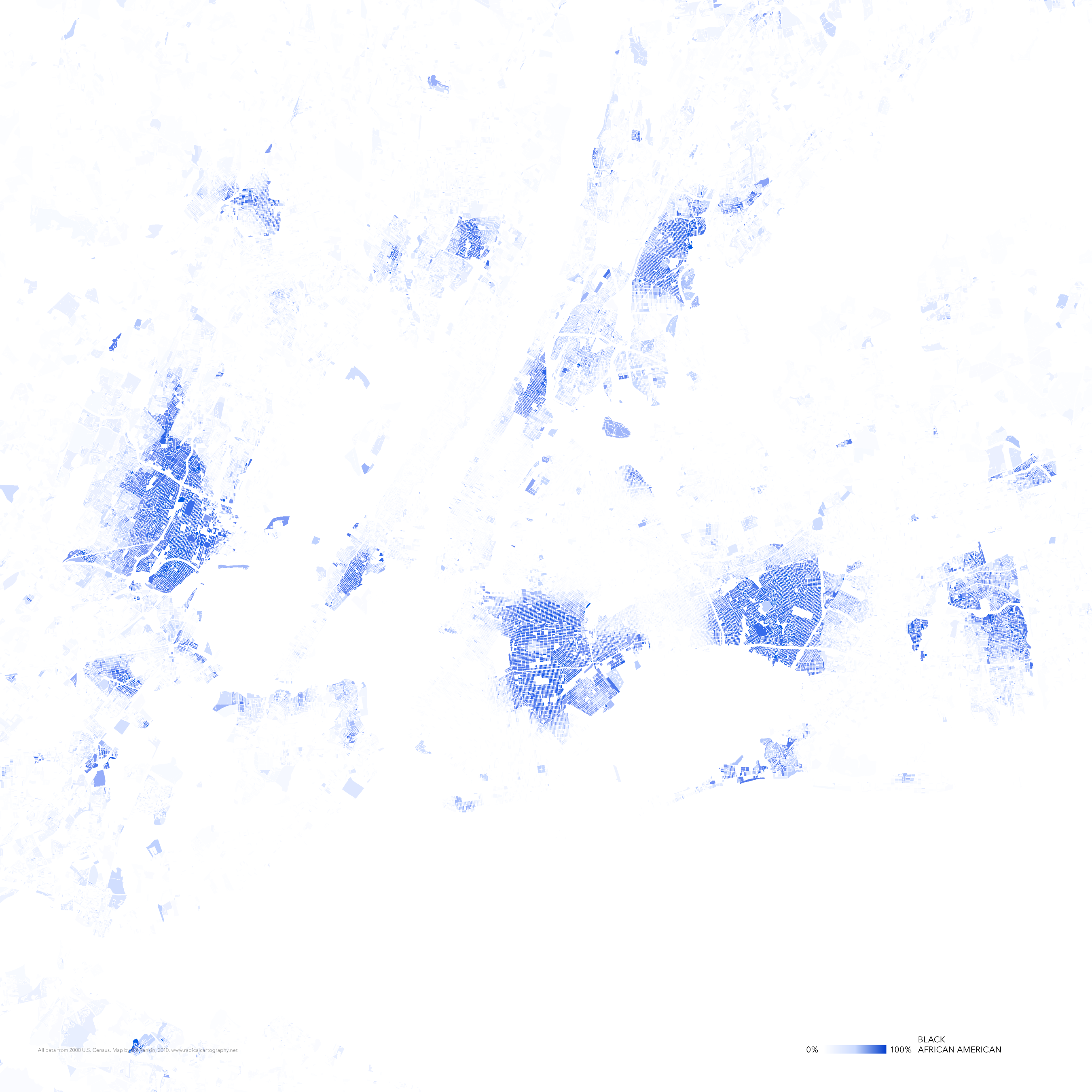
black (1.9 MB)
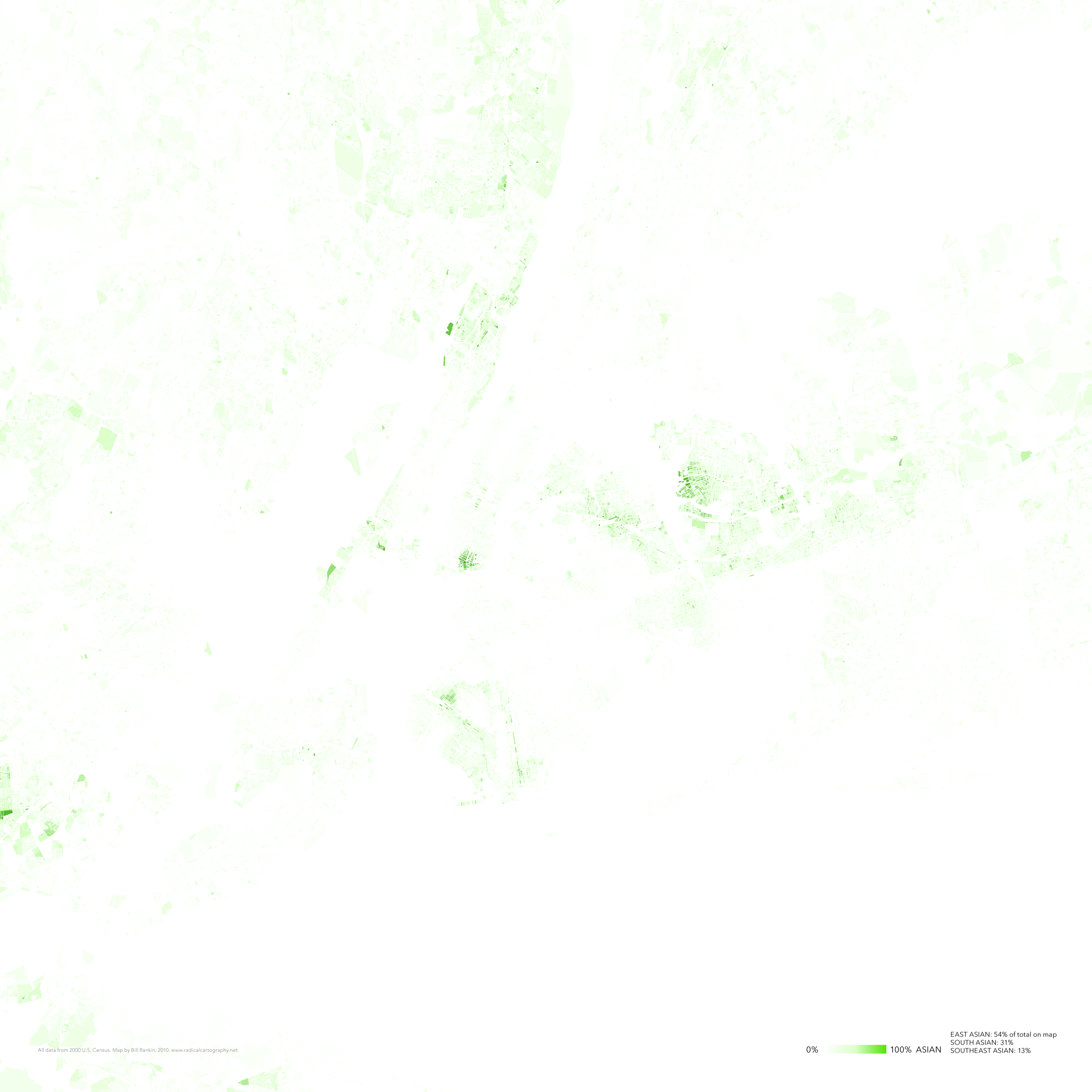
asian (2.0 MB)
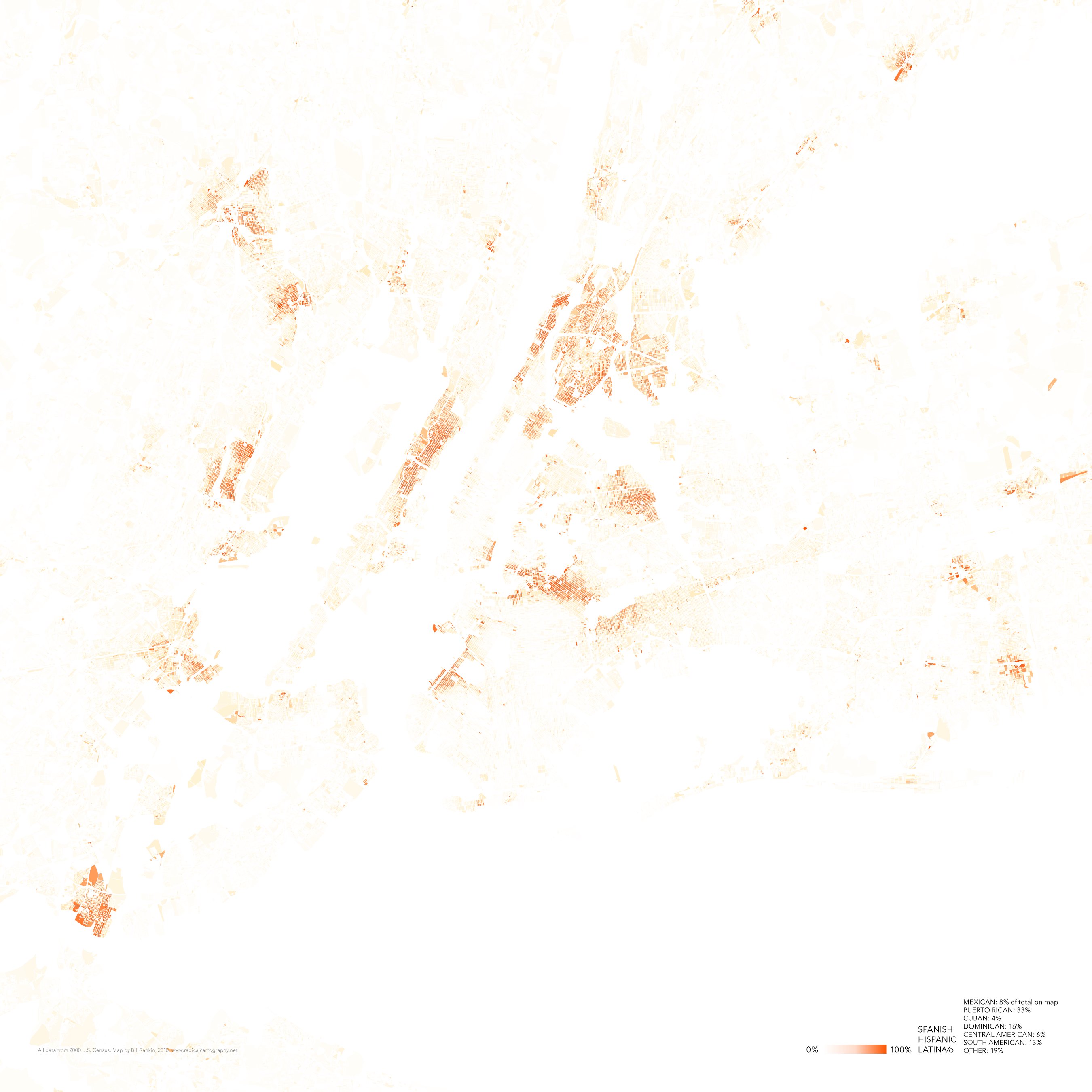
latina/o (2.5 MB)
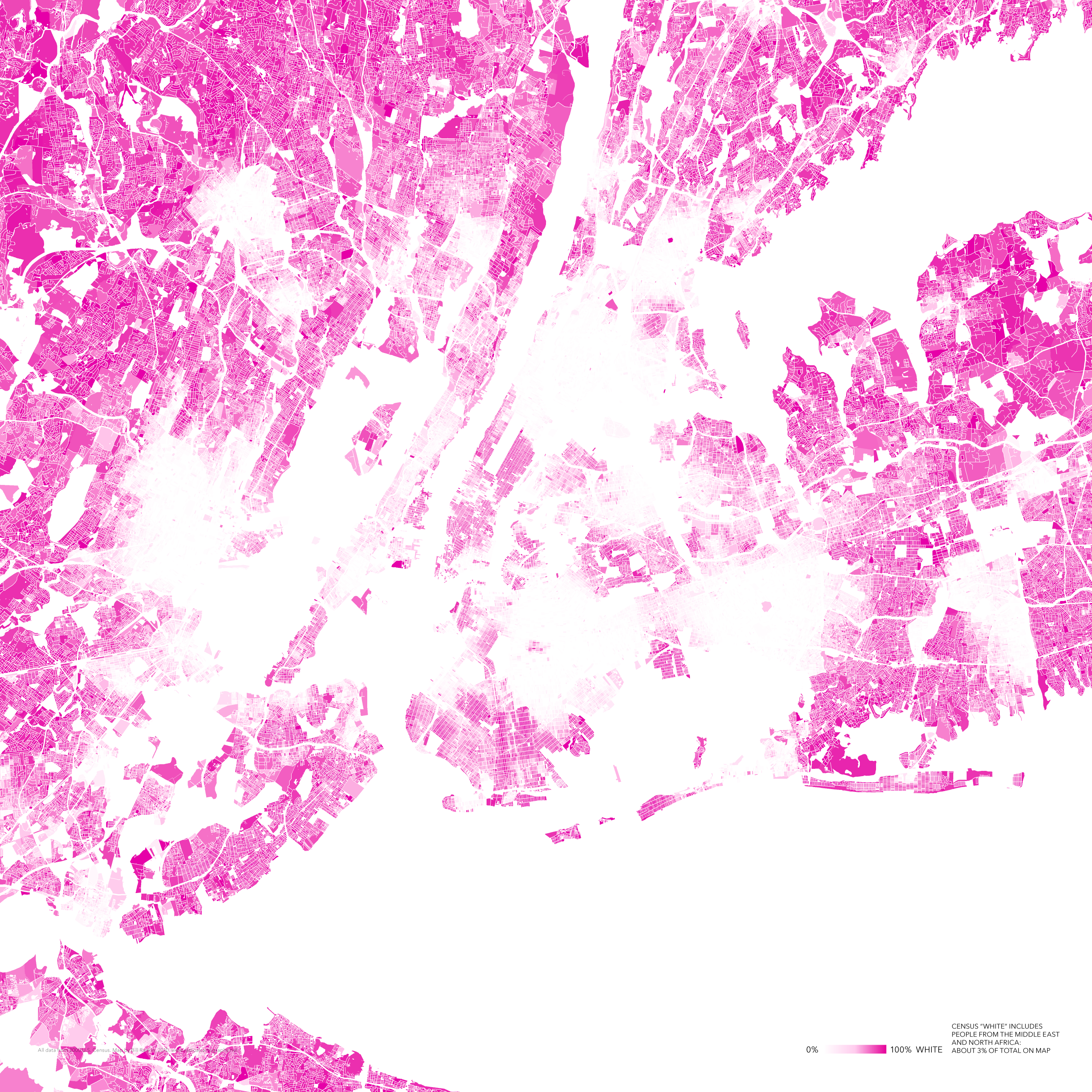
white (3.9 MB)
diversity (1.7 MB)
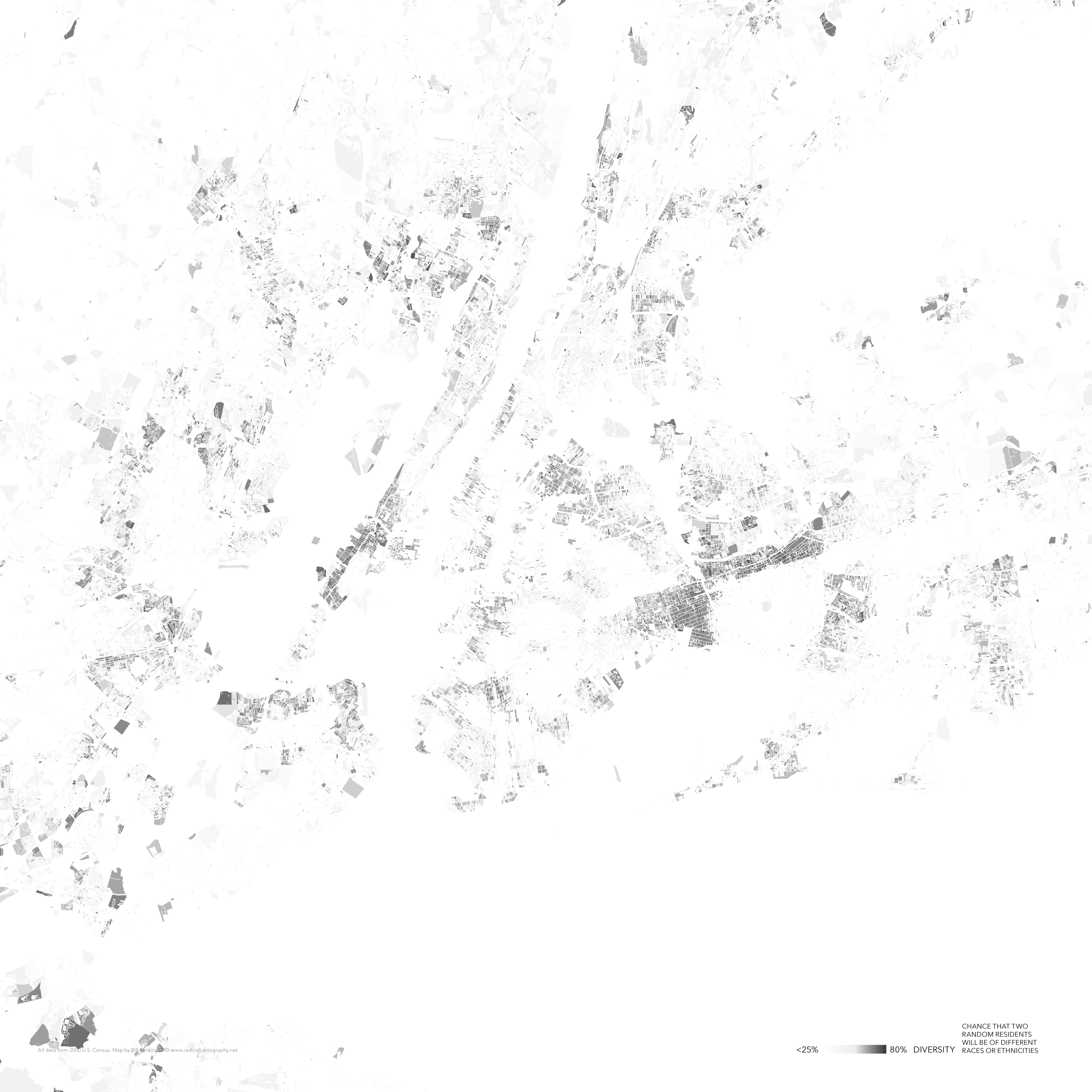
Another take on the fragmented racial landscape of American urbanism, inspired a bit by Debord’s classic cut-up psychogeographical maps of Paris. Segregation creates cities-within-cities, islands and seas of inclusion and exclusion.
All maps show the same portion of greater New York — an area about 40 miles square, centered on Manhattan.
Compared to other American cities, however, New York does have many areas of genuine diversity, where the well-armed not-in-my-backyarders compete with the fiesty and loosely organized welcome-into-my-backyard brigade. The battle of the NIMBYs and the WIMBYs continues apace.
Note: “Diversity” here indicates the chance that two randomly chosen residents will be of different races or ethnicities — i.e., the Gibbs/Martin/Blau index of diversity. All data from the 2000 U.S. Census.
