Bill Rankin, 2010
download PNGs:
Robinson (1800x950, 850k)
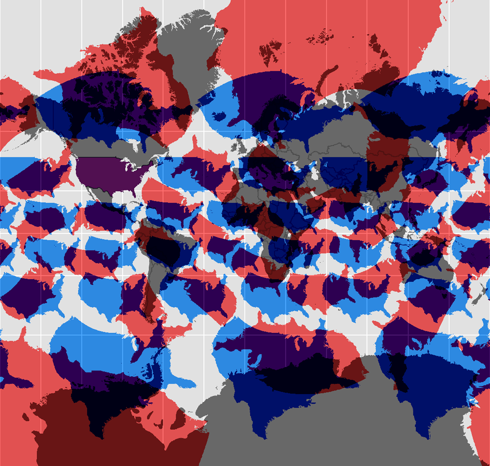
Mercator (1000x950, 600k)
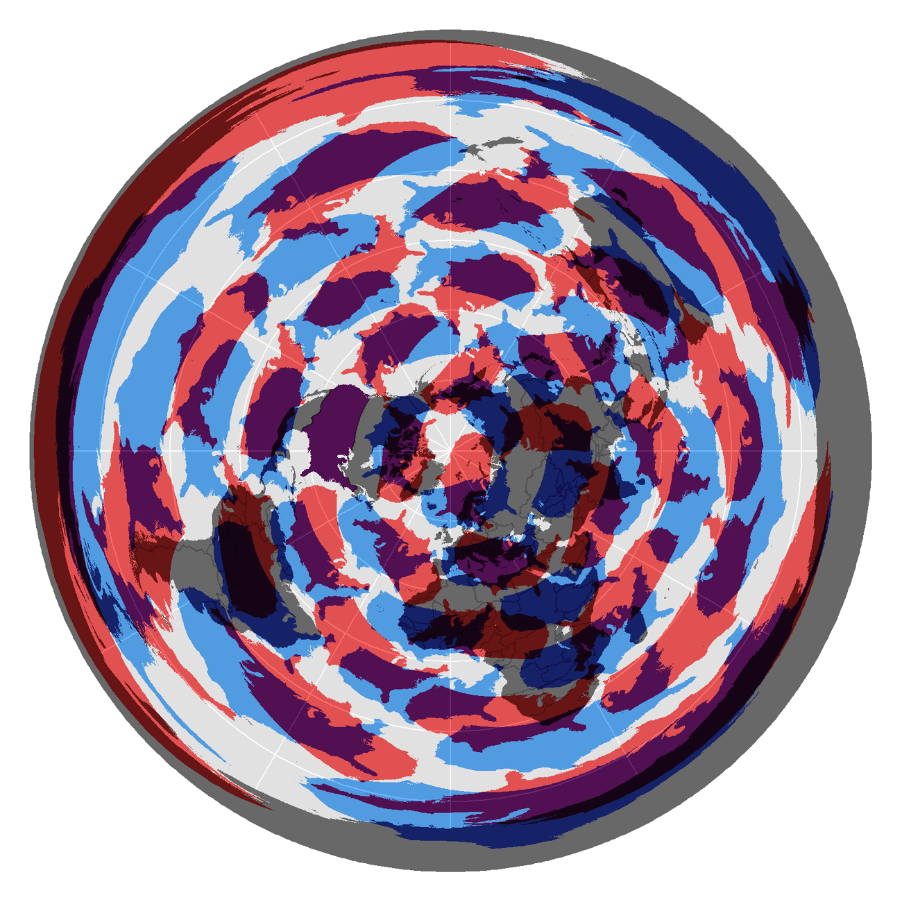
UN Logo (1300x1300, 850k)
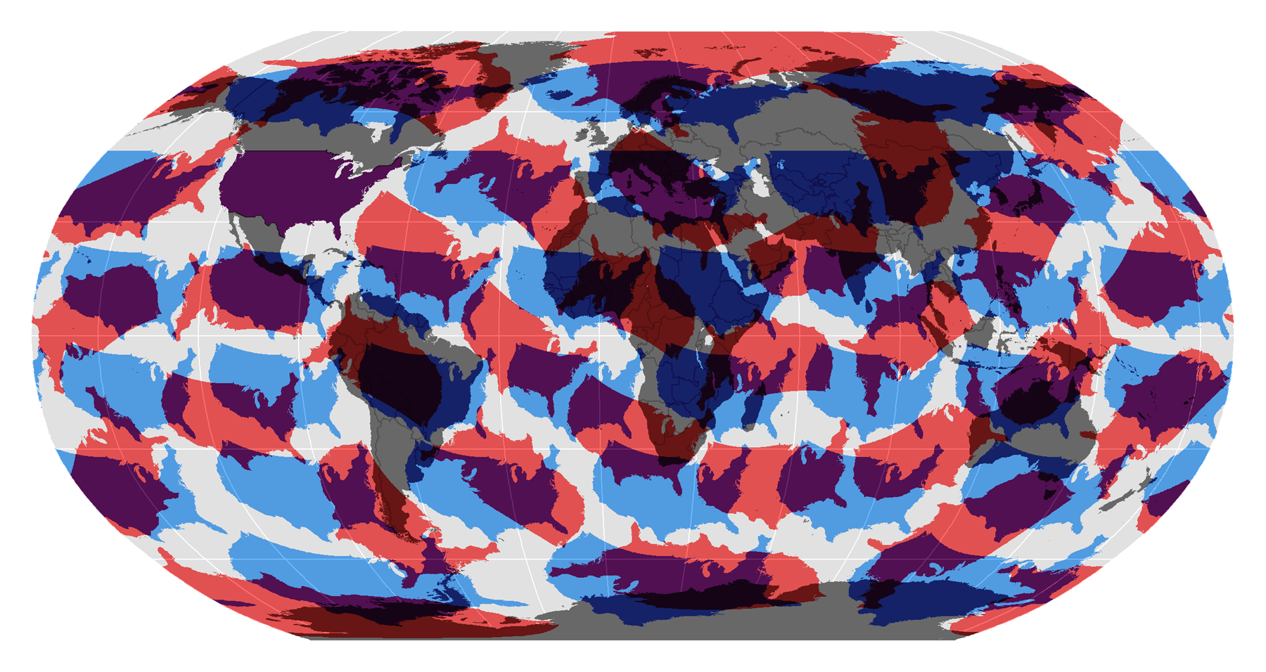
A quick project about projection!
First, sure, a snarky jab at the tendency for the U.S. to sometimes project its own values and solutions all around the world. A little modesty never hurt anyone.
Second, I've made sure to reproject the outline of the contiguous U.S. in its true proportions. This means that the colored blobs here show what the U.S. would look like if it had the same shape and area as it does now, but just happened to be located somewhere else. So notice, for example, that the 49th parallel separating the U.S. and Canada — commonly considered a “straight line” boundary — is in fact curved, and gets distorted differently as the U.S. moves around the globe. These maps are also a good reminder that certain shapes that we take for granted (coastlines in the arctic, for example) are in fact just as distorted on common world maps as the nearly unrecognizeable red pancakes are here.
Showing the same shapes on different projections makes this even clearer. From top to bottom are our friends the Robinson, the Mercator, and the Polar Azimuthal Equidistant (the last is best known as the logo for the UN).
