


|
Bill Rankin, 2006, 2010
download hi-res:
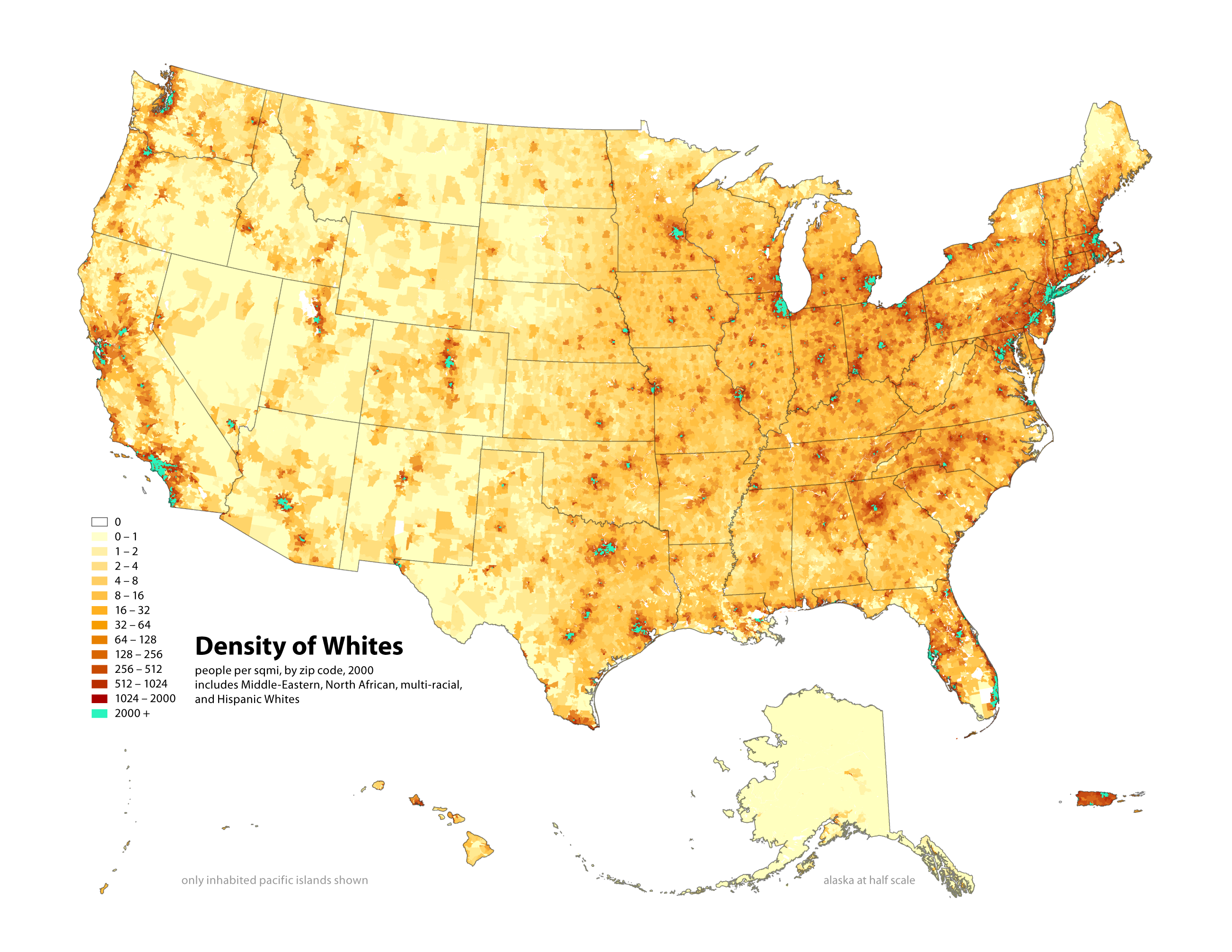
white density
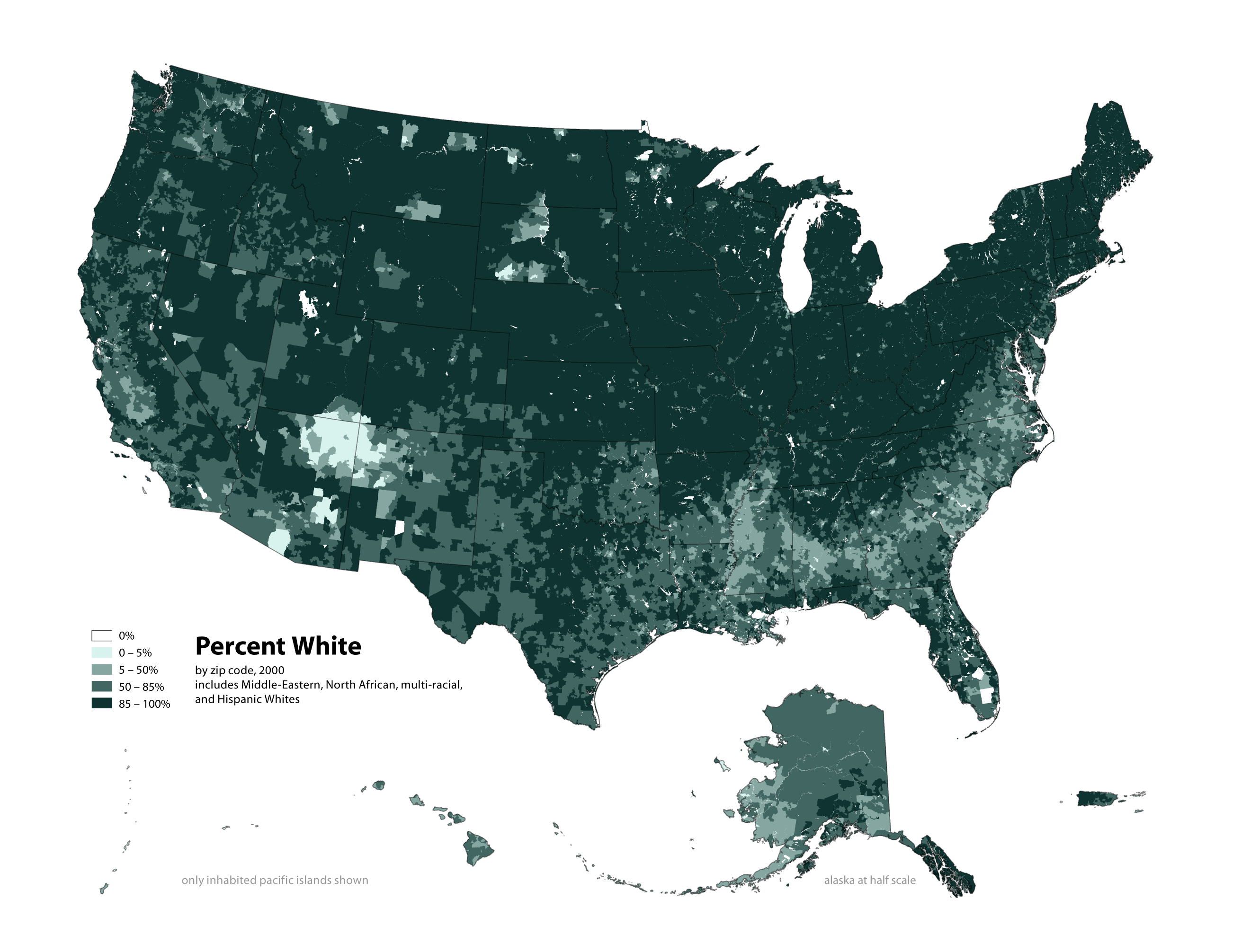
white percent
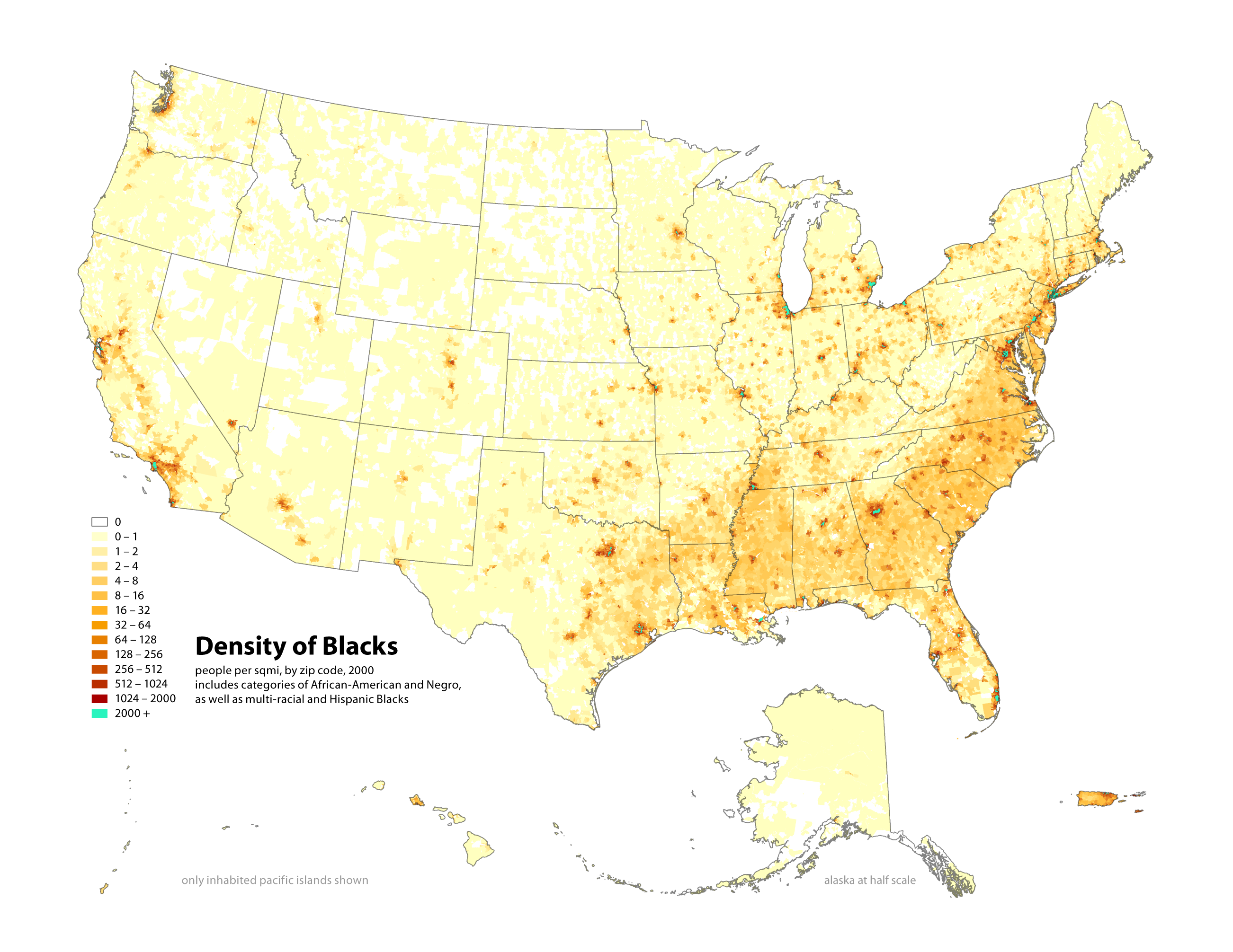
black density
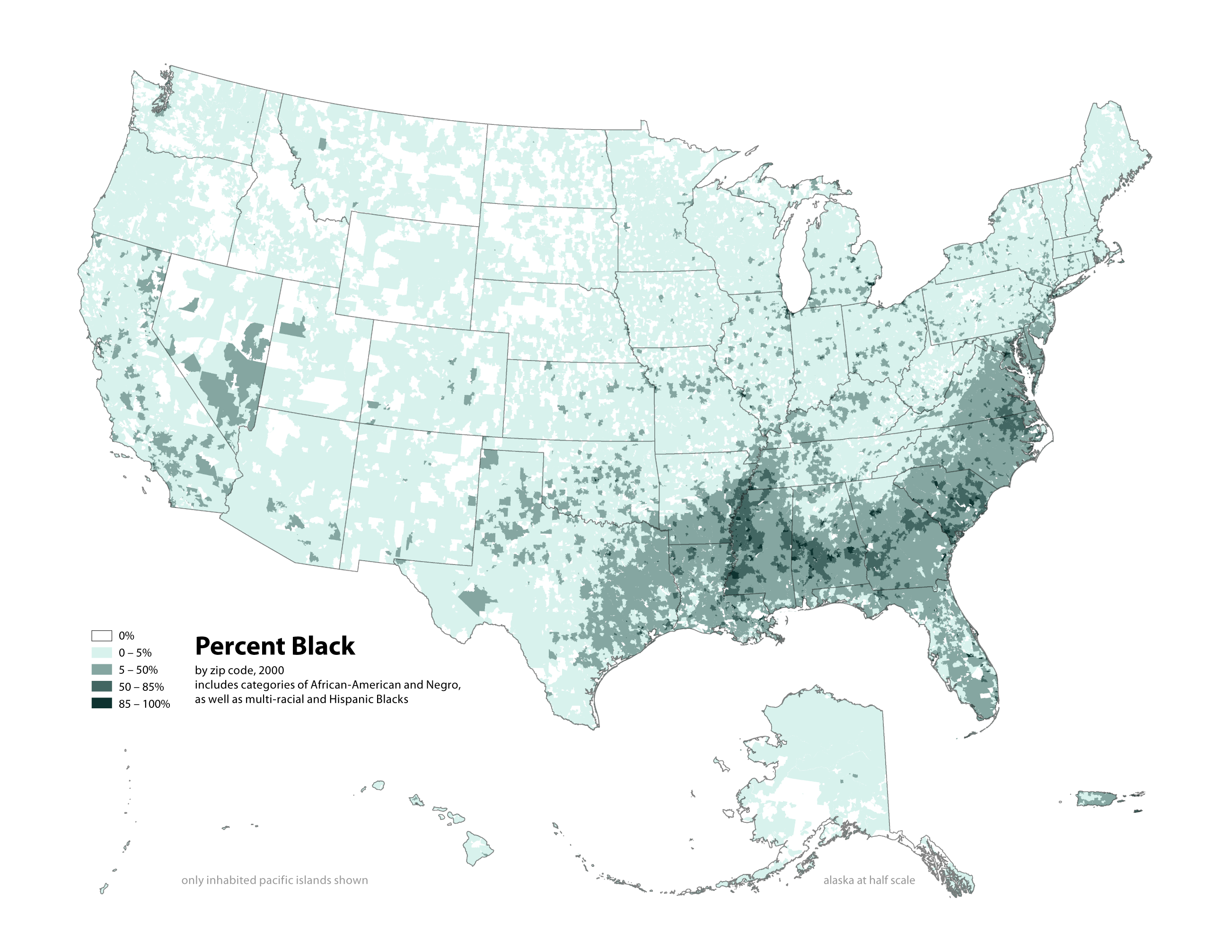
black percent
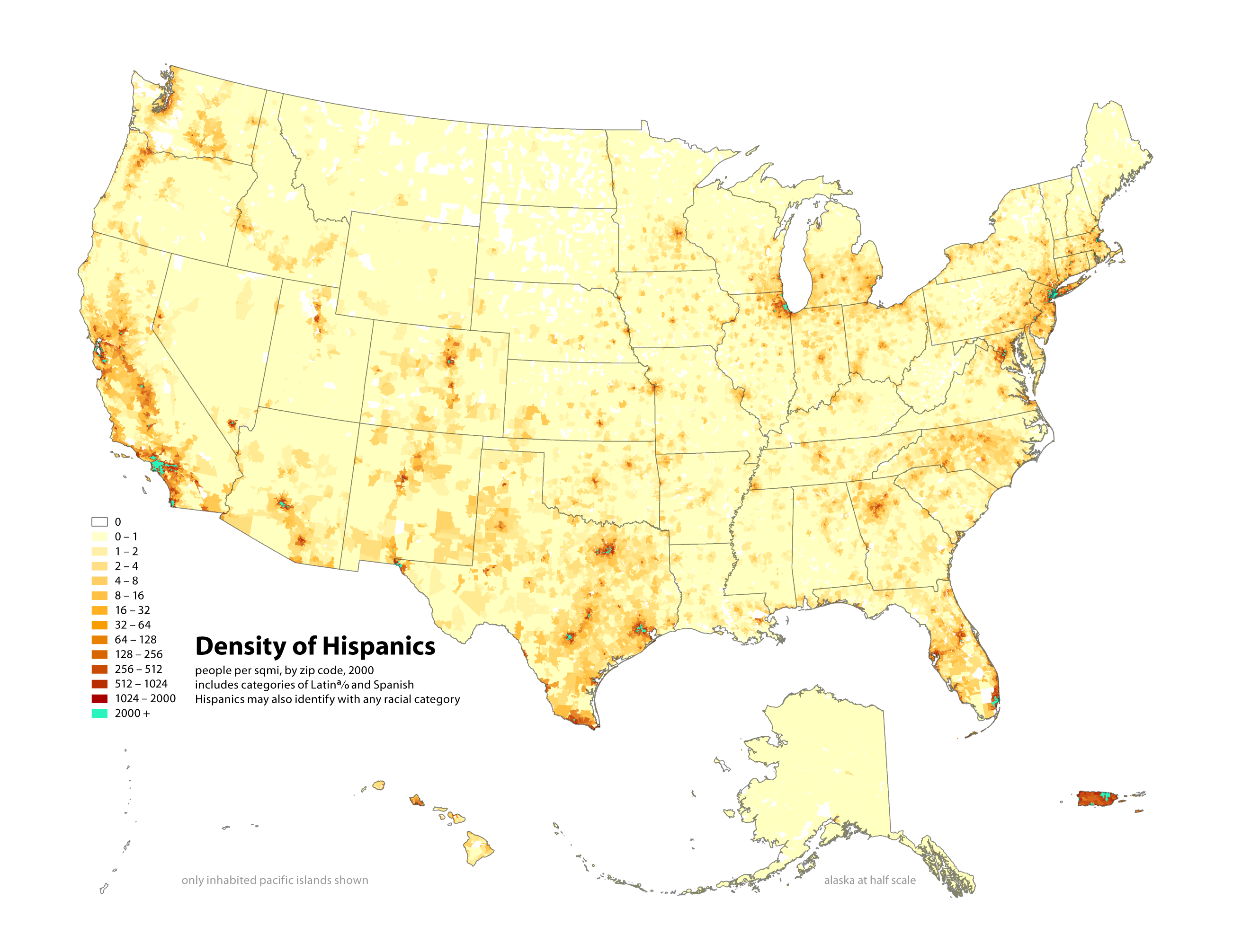
hispanic density
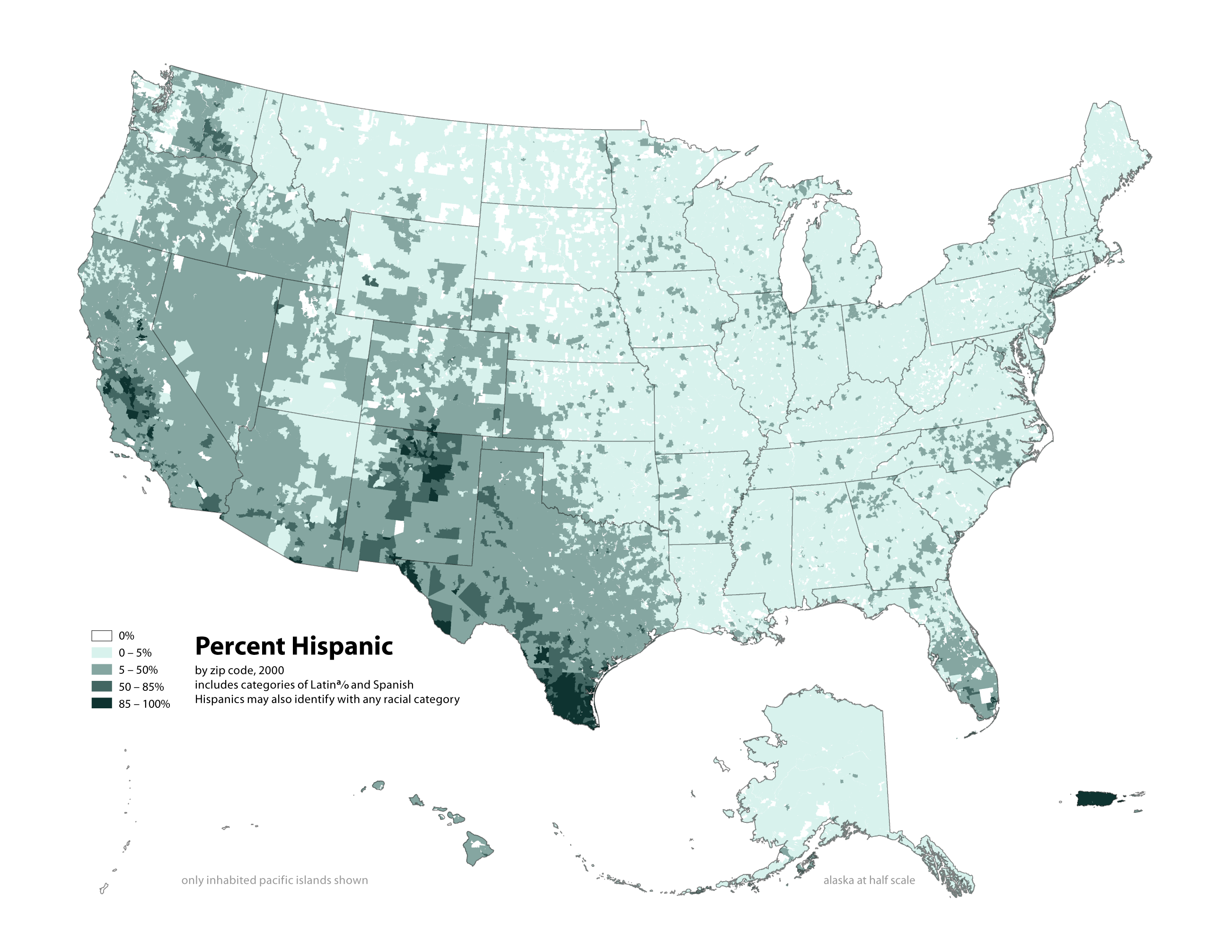
hispanic percent
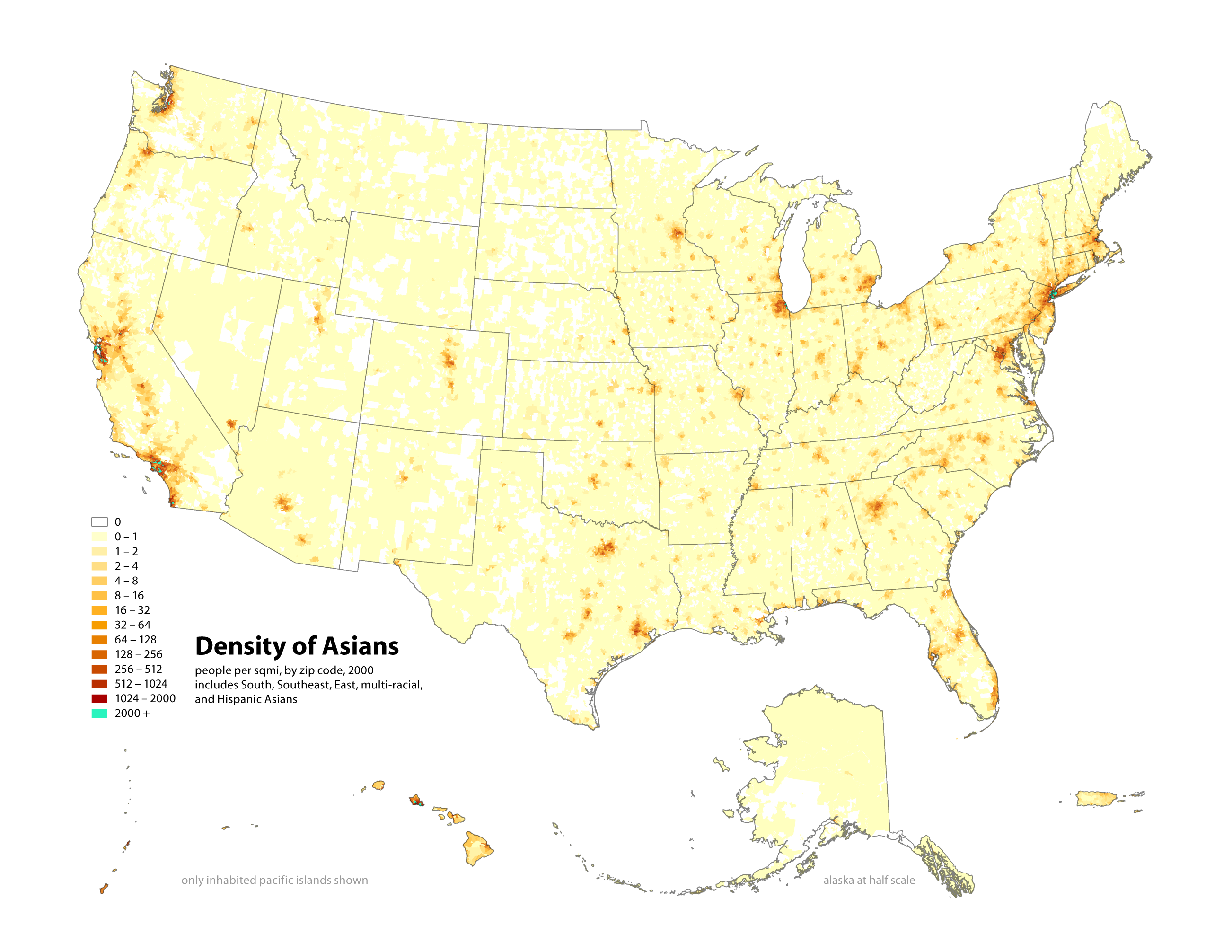
asian density
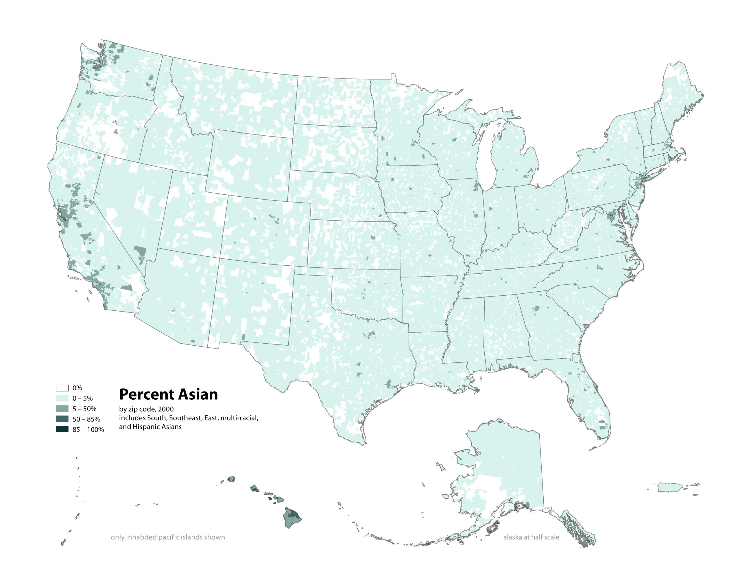
asian percent
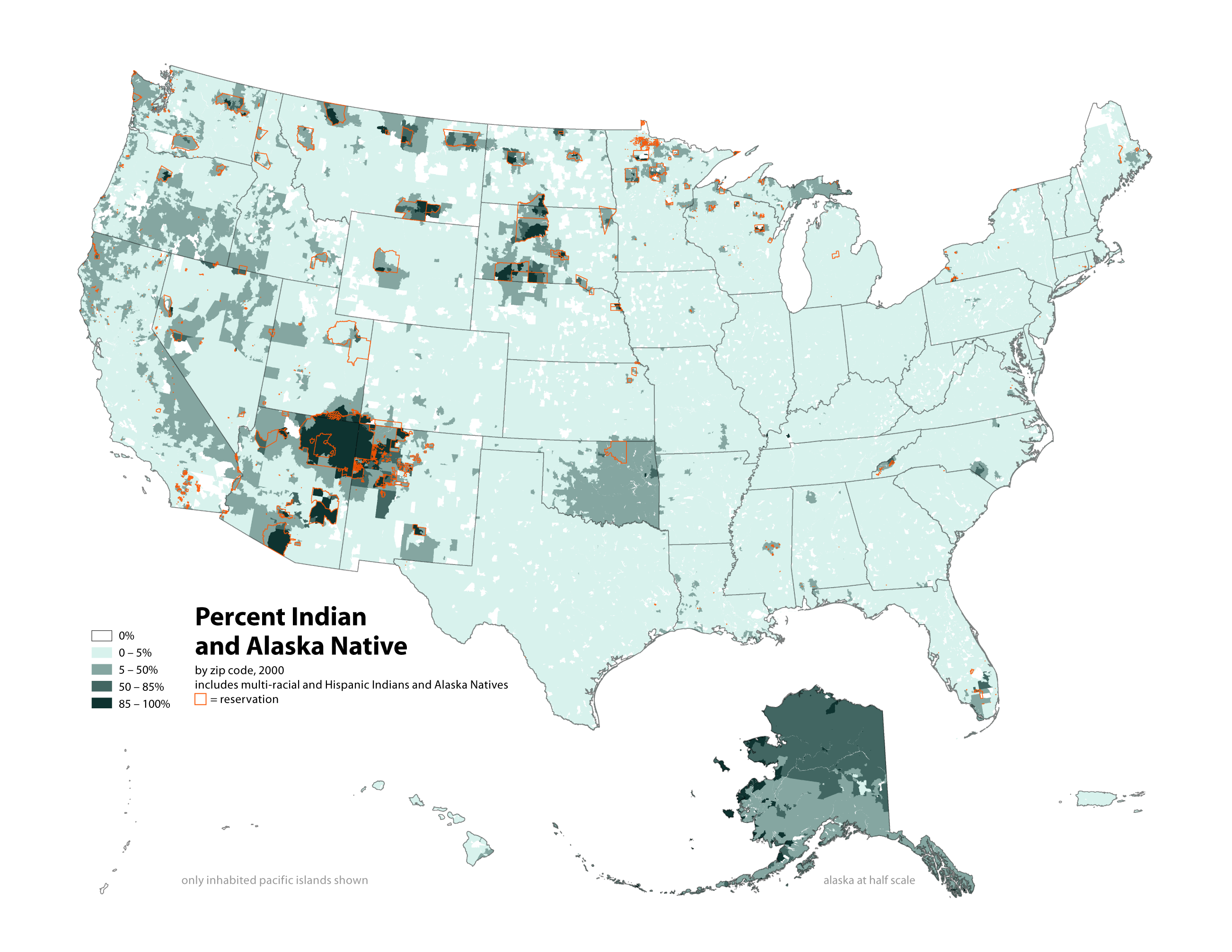
indian density
indian percent
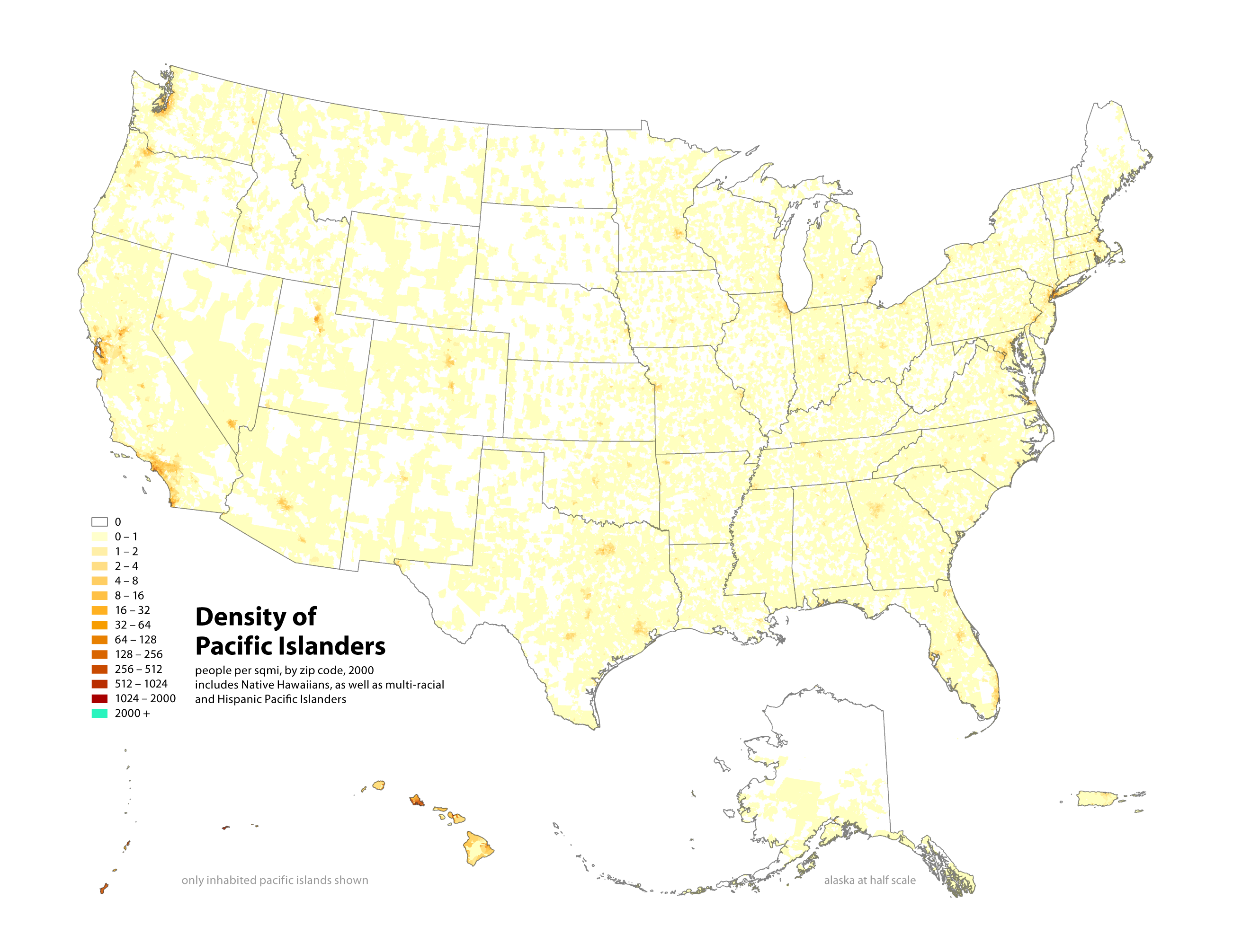
pacific density
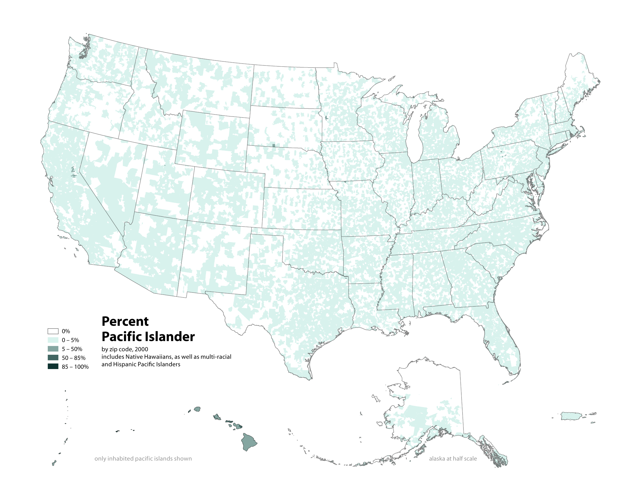
pacific percent
These are just simple redesigns of standard-issue census data, but I think they address some important shortcomings of the official maps.
First, data is displayed by zip code, not by county. There is generally a consistent relationship between the size of a zip code and population density, while counties vary much more widely in population and area. This is especially important for the large counties in southern California, where Los Angelenos can appear to be spread out over the Mojave Desert.
Second, two maps are necessary to understand the diversity of the population: an absolute measure of where people actually live (population density), and a relative measure of the majority or minority status of a population in a certain area (population as percent of total). The Census only tends to publish the latter, which woefully obscures the large minority populations in urban centers.
Of course, these changes still can’t address the problems in the census categories themselves. The Census mixes color metaphors of race with ancestry definitions of race, thus including Middle Easterners and North Africans as “white.” The Census also makes an awkward distinction between “race” and “ethnicity,” so that in 2000 more than eighteen million people — mostly “ethnic” hispanics — self-identified using the catch-all “other” category for race.
This is version 2.0.
